A warm welcome.
By design.
Rezz gives hospitality a little more room to be human. Our identity brings that feeling to life: warm, considered, and quietly confident.
A place at the table.
The rounded wordmark feels approachable and assured. The table blossom brings four seats together around a central table: a small symbol for a good gathering.



Give it room. Leave clear space of at least one blossom’s width around the wordmark. Minimum digital width: 80 px for the wordmark, 20 px for the symbol.
Keep it familiar. Use the supplied artwork. Keep its proportions. Choose a high-contrast colour pairing and a calm background; avoid shadows, outlines, or added effects.
As warm as the welcome.
Paper gives our content room to breathe. House plum carries the identity. Butter and Rose linen bring warmth; Garden is reserved for positive states.
Colour with purpose. Use House plum or Ink for readable text. Butter and Rose linen are backgrounds, not text on Paper. Keep muted colours for secondary details.
A considered balance. Aim for roughly 60% Paper, 25% photography, and 15% brand colour on marketing pages. Let one expressive moment lead each section.
Clear, with character.
Good evenings
start with rezz.
Quiet confidence. Generous scale. A little closeness between letters.
600 for headings / 800 for the wordmarkDesktop 48–76 px / Mobile 34–44 px
Full tables. A clear head.
More time for the welcome.
We speak the way a thoughtful host would: clear, friendly, and genuinely useful.
400 for body / 500–600 for emphasisBody 14–18 px / Line height 1.6–1.8
The little details,
remembered.
An occasional handwritten-feeling aside. Use sparingly, never for essential interface instructions.
400 italic / 17–24 pxSound like a good host.
Speak to the people doing the welcoming. Be specific about the useful thing Rezz does, and give the reader a clear next step.
“Make yourself at home.”
An invitation, never a hard sell.
“Your table is ready.”
The useful information, first.
“A little more ease.”
Quiet confidence, without grand promises.
Our promise. “Make room for hospitality.”
Our supporting thought. “A little more ease. A lot more hospitality.”
Stay honest. Show real product capabilities. Label demo content. Avoid invented customer stories, guarantees, superlatives, or unexplained technology jargon.
Bring the room to life.
Natural light, honest materials, and the human moments around a table. Photography supplies warmth; product graphics supply clarity.
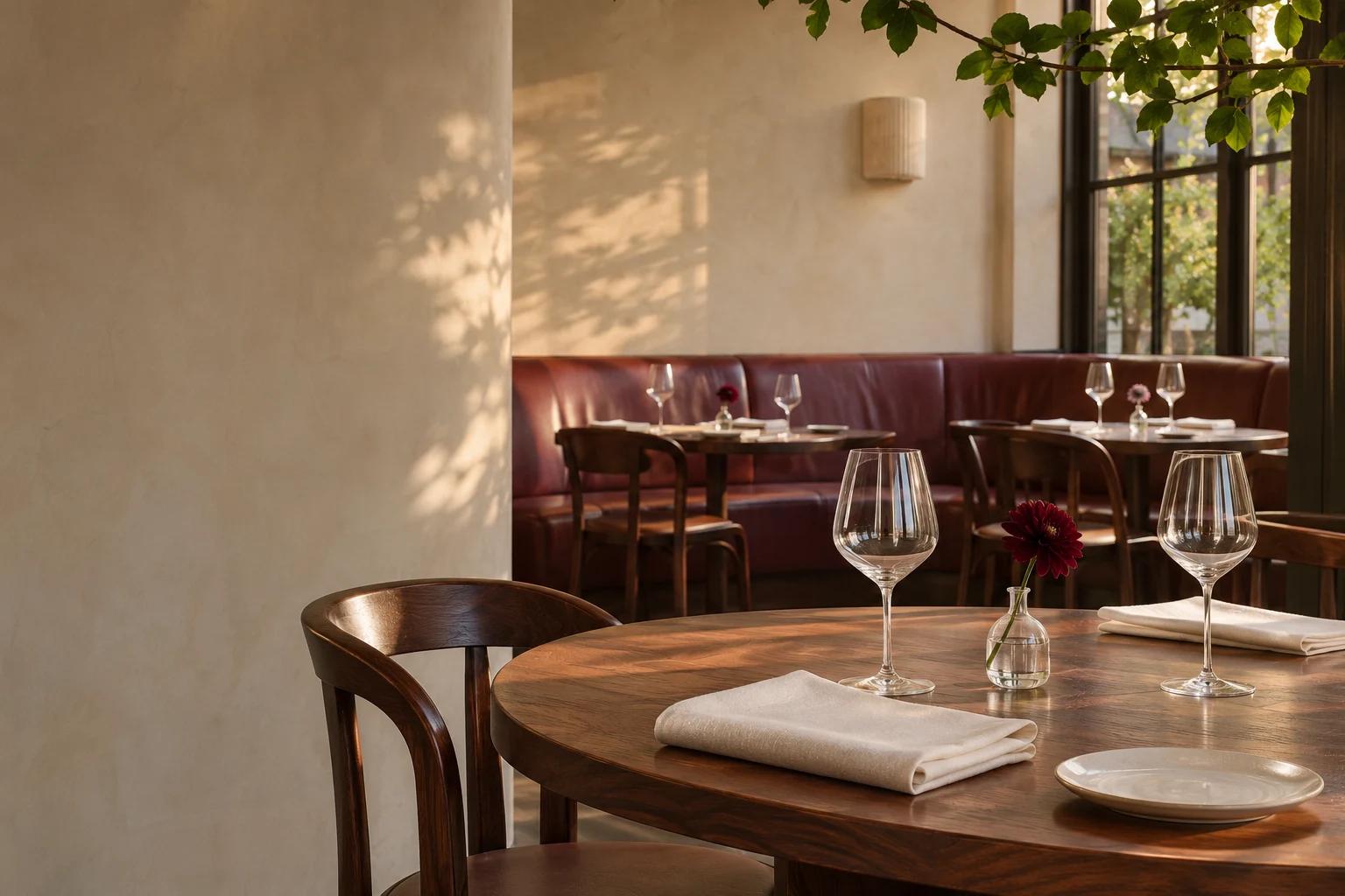
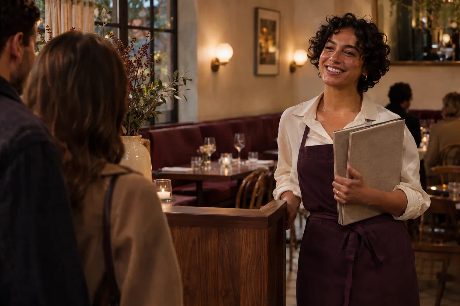
Photography. Walnut, linen, burgundy, glass, and evening light. Avoid overtly posed corporate imagery and overly orange colour grading. These original images are AI-generated brand illustrations, not customer locations or endorsements.
Motion. One quiet cinematic loop, small purposeful entrances, and animation in response to interaction. Keep loops pausable. Respect reduced-motion preferences and avoid autoplay audio.
A little consistency.
A recognisable welcome.
The kit includes outlined SVG and PNG logos, the symbol, app icon, social artwork, a repeating pattern, photography, the restaurant film, design tokens, and this guide.
Make it yours